Asia/Dhaka
Case Studies

Structuring a Large Frontend Codebase for Maintainability at Scale

image
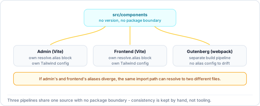
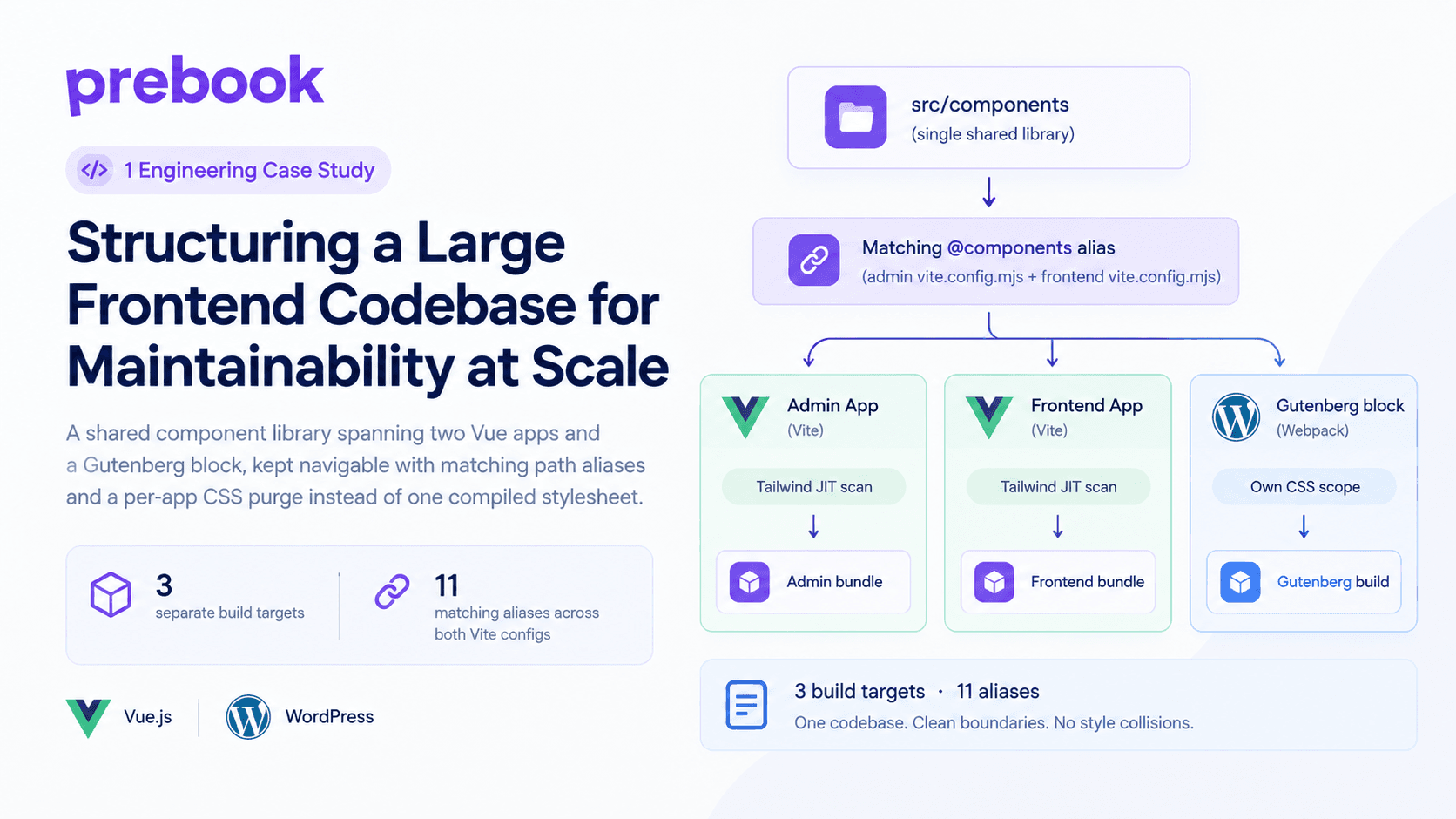
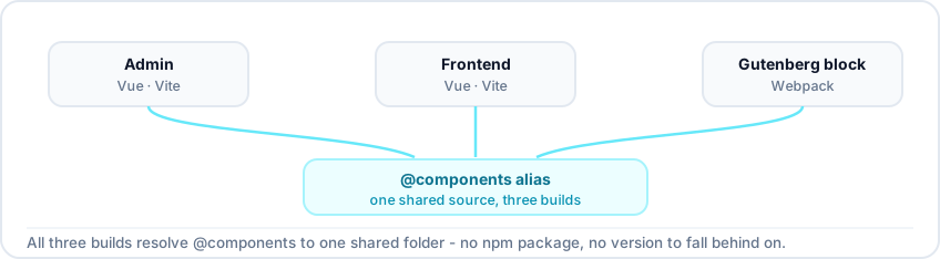
Three separate build targets - admin, frontend, and a Gutenberg block - all resolving the same @components alias to one shared source directory, each purging Tailwind independently.
PreBook's frontend is three separate build targets - an admin Vue app, a customer-facing Vue app, and a Gutenberg block built with webpack - all drawing from one shared component library. I kept that navigable with a consistent path-alias convention across both Vite configs and a Tailwind setup that scans the shared library per app rather than compiling one shared stylesheet. It mostly worked. In one spot, it didn't, and I moved the classes back to plain CSS.
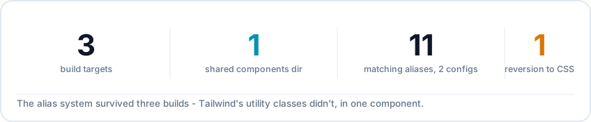
Three build targets, one shared components directory, eleven matching aliases across both Vite configs, and one deliberate reversion from Tailwind to plain CSS.
ProblemTwo independently-built Vue apps plus a webpack-built block, all needing the same shared components, without drifting onto different copies of them
What I didMatched path aliases across both Vite configs, let Tailwind scan the shared library per app, and reverted to plain CSS where utility classes stopped being readable
Why it matteredAn import means the same thing no matter which app it's written in, and each app still ships only the CSS its own pages actually use
TeamSolo
One shared components directory feeding three separately-built targets with no package boundary between them, so an import path that means one thing in admin has to mean the same thing in frontend and gutenberg.
PreBook's admin panel and customer-facing booking flow are two separate Vue 3 single-page apps, each with its own Vite config. A third piece, the Gutenberg block, is built separately with webpack because that's what the Gutenberg tooling expects. All three consume the same shared component library, and the two Vue apps share the same utilities, icons, and data helpers too.
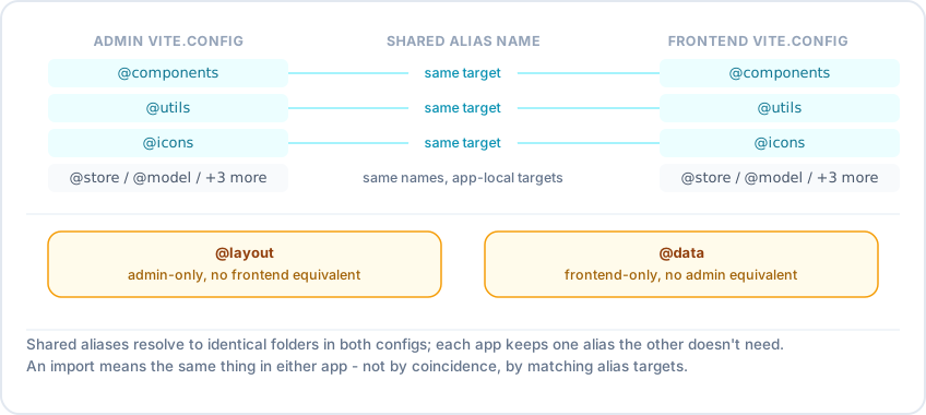
Both vite.config.mjs files define the same alias names pointing at the same target folders: @components, @utils, @assets, @routes, @store, @model, @views, and @icons resolve identically from admin and frontend; @layout is admin-only, @data is frontend-only.
src/admin/vite.config.mjs and src/frontend/vite.config.mjs each define a resolve.alias block, and I kept the shared entries pointing at the exact same targets in both:
  • @components and @icons resolve to the top-level src/components and src/icons folders
  • @utils resolves to src/utilities
  • @admin/@frontend let either app reach into the other's source when it needs to
  • @assets, @routes, @store, @model, and @views are app-relative in both configs, pointing at each app's own local subfolder of the same name, so the alias shape is identical even though the target is local per app
  • What matters is that the aliases both apps do share resolve to the same place, so import { Select } from '@components' means the identical file in either app
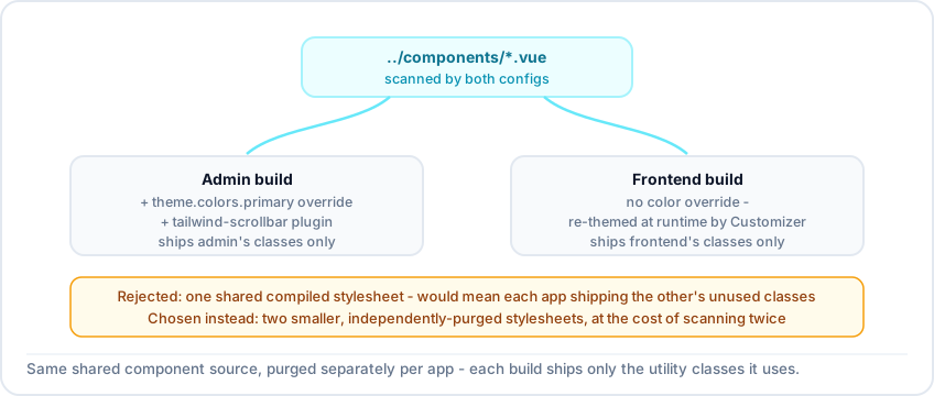
Both tailwind.config.js files list ../components/*.vue directly in their content scan array, so Tailwind's JIT purge runs separately per app build against the identical shared component source, producing two different, smaller stylesheets instead of one shared one.
Both tailwind.config.js files - one per app - list ../components/*.vue in their content scan array, alongside each app's own views/*.vue. Tailwind's JIT compiler runs once per app build and keeps only the classes that app actually uses. I didn't compile one shared stylesheet for both apps - that would ship dead CSS to each of them, since neither build would know which classes the other needed. Scanning per app costs a duplicated scan, not extra bundle size. Admin's config also adds its brand color and a scrollbar plugin; frontend skips theming at build time since its look is set at runtime through the Customizer. The Gutenberg block sits outside this - it's built with its own webpack.config.js, since that's what the WordPress block editor expects, and it keeps the block's CSS from conflicting with other plugins on the same page.
A staff profile card's markup before and after: a class list full of one-off bracket values like w-[50%], h-[130px], bg-[#EAECF0], and mt-[-75px], converted to a single named class .staff-profile-slider backed by real SCSS rules.
One frontend component had things like w-[50%], bg-[#EAECF0], and mt-[-75px] stacked in its template - arbitrary-value classes standing in for one-off pixel offsets and hex colors with no design token behind them. Technically fine, but unreadable as a class list. I moved that to a single semantic class per element (.staff-profile-slider, .slider-pagination, .profile-image-box) backed by real SCSS. Utility classes are still the right default for most of PreBook's UI - it's specifically the arbitrary-value escape hatch, used repeatedly on one component, that wasn't worth it.
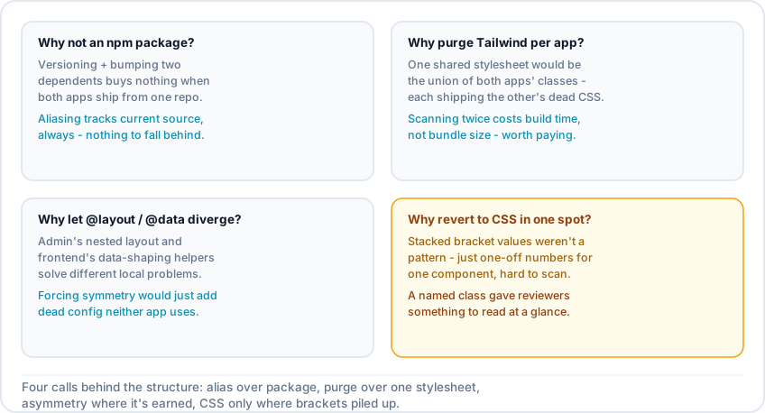
Four judgment calls: why alias instead of an npm package, why purge Tailwind per app instead of sharing one stylesheet, why revert to plain CSS in one spot, and why let the alias sets diverge between admin and frontend.
Why not publish the component library as an npm package instead of aliasing it? Versioning would mean bumping and republishing on every change, for two apps deployed together from the same repo. Aliasing keeps both apps on current source with nothing to fall behind on. Why let each app purge Tailwind separately instead of sharing one compiled stylesheet? A shared stylesheet would ship admin's CSS to frontend and vice versa. Running the scan twice costs build time, not dead CSS to every visitor. Why move away from Tailwind classes in that one spot instead of just living with the bracket syntax? The bracket values were one-off numbers, not a pattern, and made the markup harder to read than the CSS it replaced. Generic utility class names also risk colliding with other plugins' CSS in the WordPress environment, which a named class avoids. A named class gives a reviewer something to scan instead of decoding brackets.
Part of the A Shared Component Architecture for a WordPress Booking Plugin series →

Related case studies

A Shared Component Architecture for a WordPress Booking Plugin - 4 Case Studies

A Shared Component Architecture for a WordPress Booking Plugin - 4 Case Studies

A solo, year-long build of a 44-component Vue library shared between two independently built apps inside a WordPress booking plugin - four linked case studies covering API boundaries, state, resilient input handling, and codebase structure.
Engineering Resilient Input Components for Real-World Data

Engineering Resilient Input Components for Real-World Data

Building a price input for PreBook that reformats live with locale-correct separators while keeping the text cursor exactly where the user left it.