Dhaka, Bangladesh
Case Studies

Two Rows That Look the Same and Aren't

Cover image for the case study "Two Rows That Look the Same and Aren't"
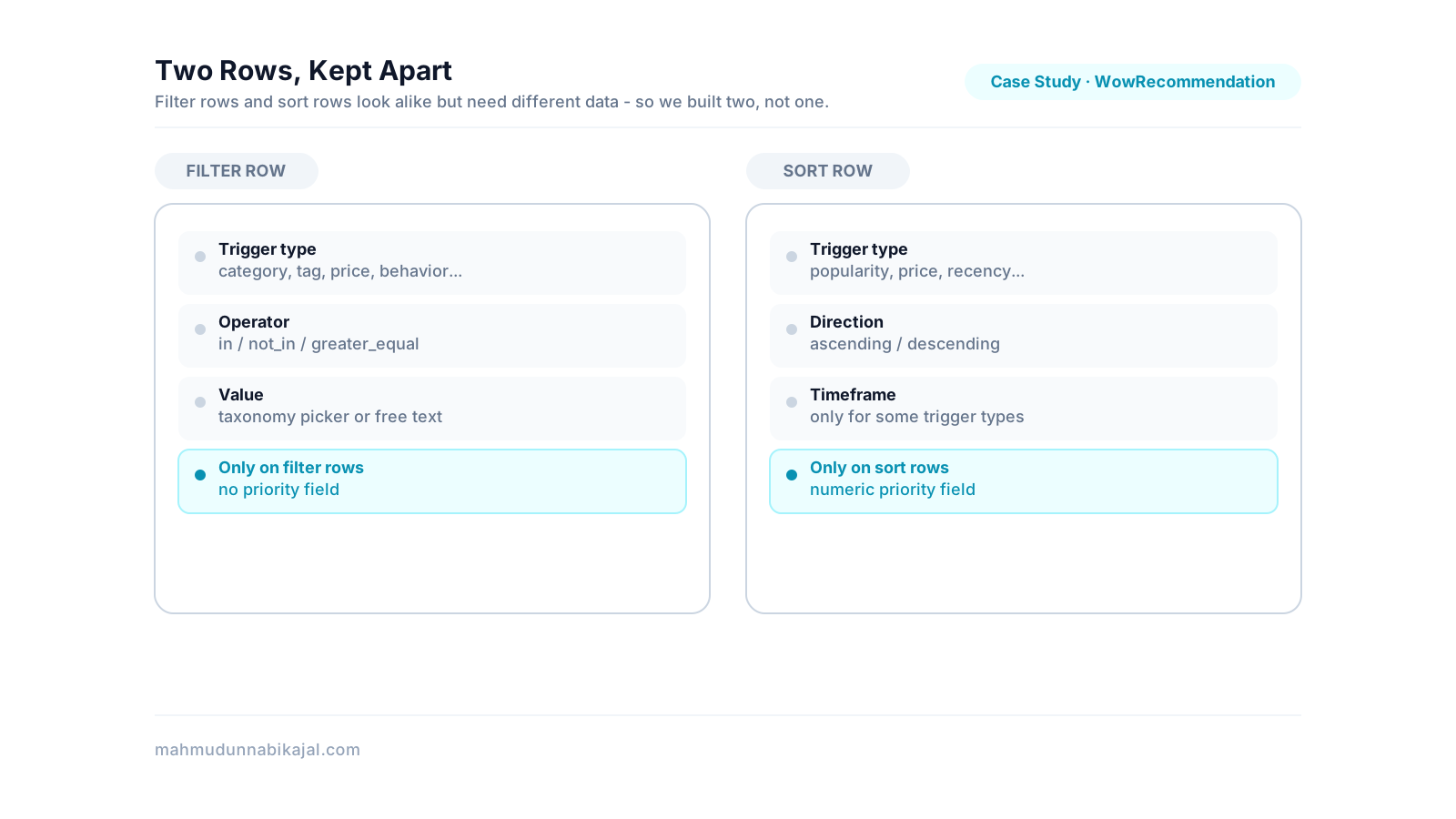
A filter row and a sort row drawn with the same outer shape but different inner content - kept as two components instead of one.
The recommendation builder needed two kinds of dynamic row: one for filter rules (which products qualify) and one for sort rules (what order to show them in). They share the same interaction - add a row, pick a trigger type, remove a row - and at a glance they look like the same component wearing two hats. We built them as two separate, structurally parallel components instead of one shared abstraction, because the parts that looked the same weren't the parts that actually mattered.
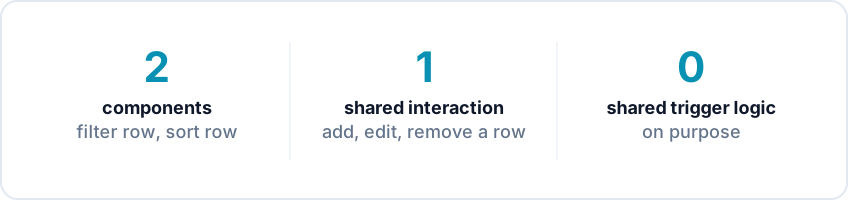
Two components, one shared interaction pattern, zero shared trigger logic between them.
TL;DR summary
The problemFilter rows and sort rows look alike but need different trigger vocabularies, different value shapes, and different page-level restrictions
What we didBuilt them as two components sharing an interaction pattern, not one component sharing logic
My roleKept the two components organized together and structurally consistent as the codebase was reorganized around them
OutcomeNeither builder inherited constraints that only made sense for the other
Trade-offSome duplicated shape in exchange for not forcing one abstraction to serve two different jobs
TeamBuilt and maintained as shared codebase work
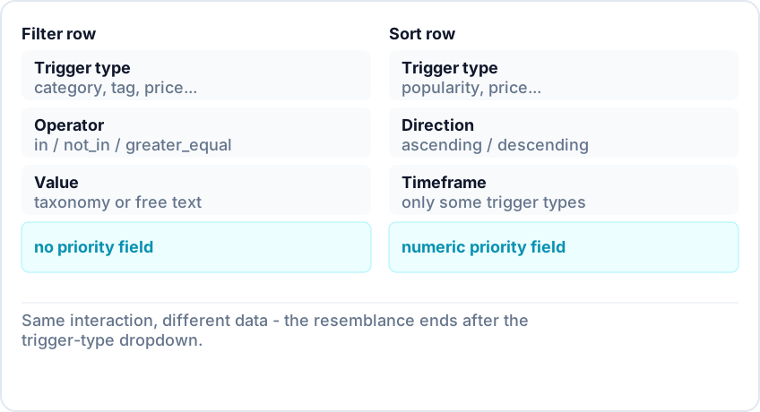
Filter row (trigger, operator, taxonomy or free-text value) compared against sort row (trigger, direction, optional timeframe, priority number).
A recommendation list in the builder has two dynamic sections: filter rules that narrow down which products qualify, and sort rules that decide what order the qualifying products show in. Both are rendered as a list of rows, each with an "add" control and a per-row "remove" button, and each row starts with a dropdown for the rule's trigger type. That's where the resemblance ends. A filter row's trigger type determines what kind of value input it needs - a taxonomy picker, a free-text range, or nothing at all - and its relation options are filter operators (in, not_in, greater_equal). A sort row's trigger type determines a sort direction and, for some trigger types only, a timeframe - plus a numeric priority field filter rows don't have at all. Sort rows also restrict which trigger types are even selectable depending on which kind of page the list is attached to; filter rows don't have that restriction.
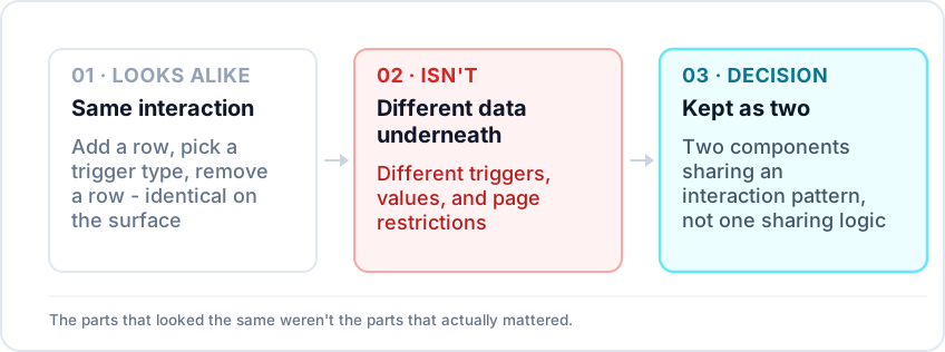
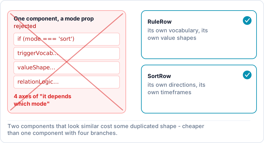
A single mode-branching component crossed out, next to the two-component version with no branching - the rejected option next to the chosen one.
The surface similarity - both are a labeled select feeding a conditional second control - made a shared row component that took a mode prop tempting. We didn't build it that way. A single component handling both would have needed internal branching for trigger vocabulary, value-input shape, relation semantics, and page-based restrictions - four different axes of "it depends which mode you're in," for a component whose whole job was supposed to be simple. Two components that happen to look similar cost some duplicated shape. One component trying to be both costs a permanent mode check running through every piece of its logic. We chose the duplication.
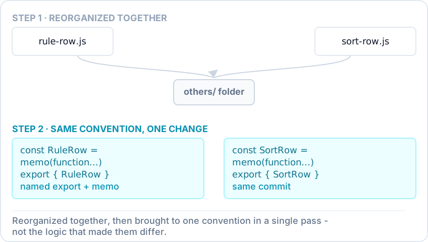
Two component files reorganized into the same parent folder, then brought to the same export and memoization convention in a single follow-up change.
My part of this was keeping the two components disciplined as siblings rather than letting them drift into inconsistent styles over time. I reorganized both into a shared parent folder alongside the builder's other row-style components, so a developer looking for one would find the other next to it. In a later pass, I brought both up to the same convention at the same time - the same named-export style, the same memoization wrapping - in a single change, rather than updating one and leaving the other stale. Neither change touched what made the two rows different. That was deliberate: the goal wasn't to make them more alike, just to stop them from looking like they belonged to two different code styles when they belonged to the same feature.
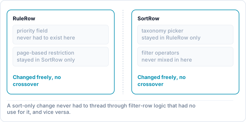
A filter row unaffected by a sort-only concept and a sort row unaffected by a filter-only concept - two clean boxes with no crossover.
Because the two stayed separate, a change to sort-only behavior - like the page-based trigger restriction - never had to thread through filter-row logic that had no use for it, and vice versa. The cost was two components with a similar outer shape instead of one; the benefit was that neither had to carry a branch of logic for a job it didn't do.
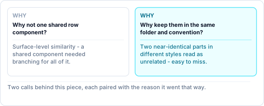
Two questions this section answers: why not share one row component, and why keeping them in sync mattered.
Why not build one shared row component for both filters and sorting? Because the similarity was surface-level. The two needed different trigger vocabularies, different value shapes, and different page-based restrictions - a shared component would have needed branching logic for all of that, which is a worse trade than two components that happen to look alike. Why does it matter that you kept them in the same folder and convention? Because two components that look nearly identical but live in different parts of the codebase, in different styles, read as unrelated - which makes it easy for someone to "fix" one without checking whether the other needed the same fix. Keeping them adjacent and consistent kept that connection visible.
Part of the Product Recommendations admin builder case study series →
On this page
Quick answer
TL;DR
The situation
Why we didn't build one shared row component
What I did
The result
FAQ