Quick answer
TL;DR
| Problem | Two apps share one component library with no version boundary - a component's public API has to work for both apps' actual needs, not a guess at what might be needed |
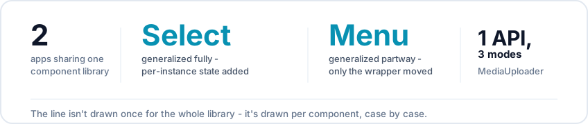
| What I did | Drew the shared/local line per component: Select generalized fully after fixing its state model, Menu generalized only as a structural wrapper, MediaUploader unified three interaction modes behind one prop API |
| Why it mattered | A boundary drawn too far in either direction either breaks on the app that didn't need the extra logic, or duplicates code the library was supposed to prevent |
| Team | Solo |
| Part of | A Shared Component Architecture in a Monorepo → |
One library, two apps, no version boundary
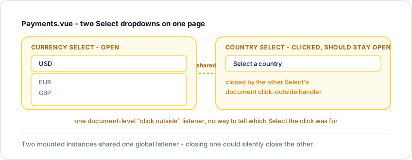
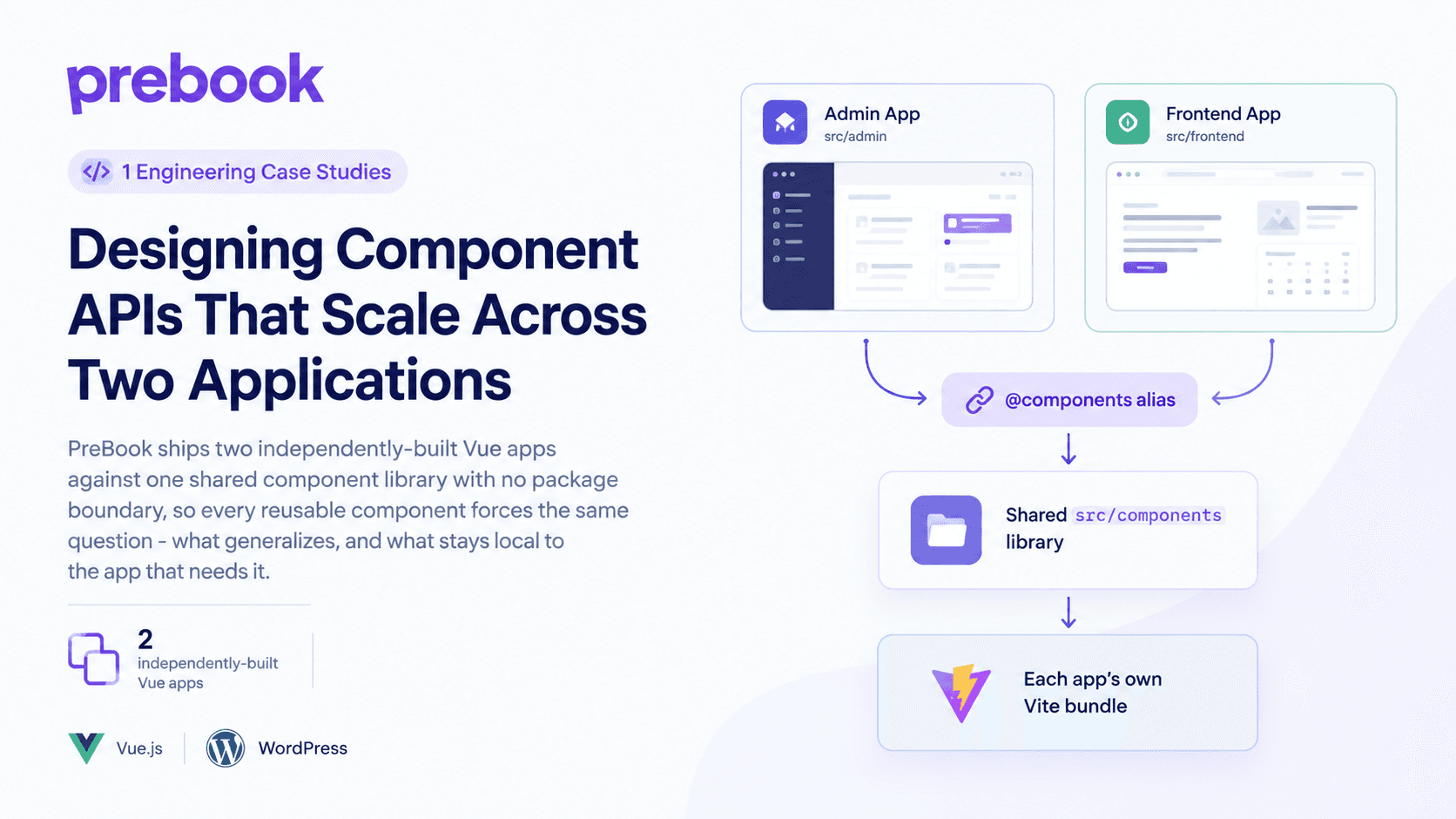
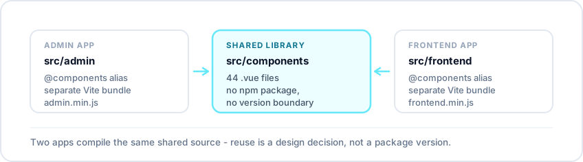
- src/admin and src/frontend are built and deployed separately, but both alias @components to the same folder - a change reaches both apps on their next build, with no publish step and no version to pin
- That also means nothing catches a component whose API only ever worked for the app it was first written against
- Select.vue surfaced this: used across both apps, working fine as a single implementation - until a page mounted two instances at once. PreBook's payment settings screen has a currency selector and a country selector on the same form, and opening one would close the other
Select: the state that couldn't be shared
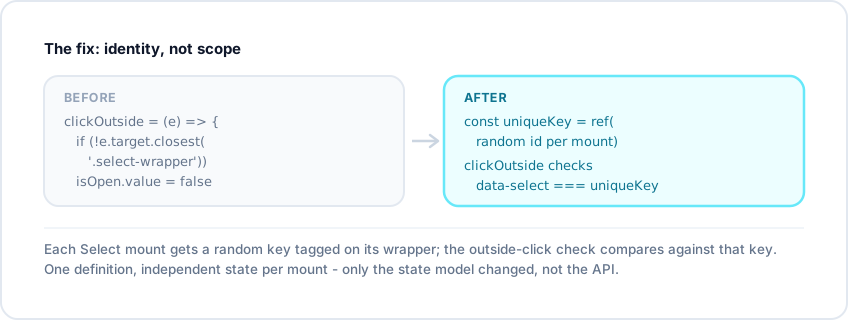
- The original clickOutside handler checked for the .select-wrapper class - a structural check, not an identity check. It couldn't tell two Select mounts apart, only that a click landed inside "a" select wrapper
- With one instance, that never mattered. With two, the first instance's listener fired on a click meant for the second and closed the wrong dropdown
- The fix: give each mount its own identity - a random uniqueKey at mount time, tagged as a data-select attribute, checked in the click-outside handler instead of the generic class
- The component stayed one file, unchanged in shape. Only the assumption baked into its state - that only one would ever exist on a page - had to go
Menu: where I drew the line
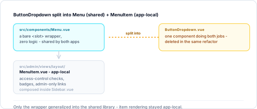
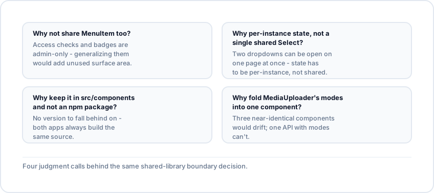
- The admin sidebar started as one ButtonDropdown component doing both the menu's structure and each item's rendering. It got split into Menu and MenuItem - only one moved to the shared library
- src/components/Menu.vue is a bare <div>/<slot> wrapper, no props, no logic
- MenuItem.vue stayed in the admin app - it handles permission checks, badges, and admin-only links that frontend has no use for and no equivalent sidebar to put them in
- Sharing MenuItem too would mean shipping admin-only logic to an app that never renders it, or designing a speculative prop API nobody needed yet. Splitting at the real seam - structure shared, per-item logic local - avoided both, and still saved the duplication that mattered
What actually generalizes
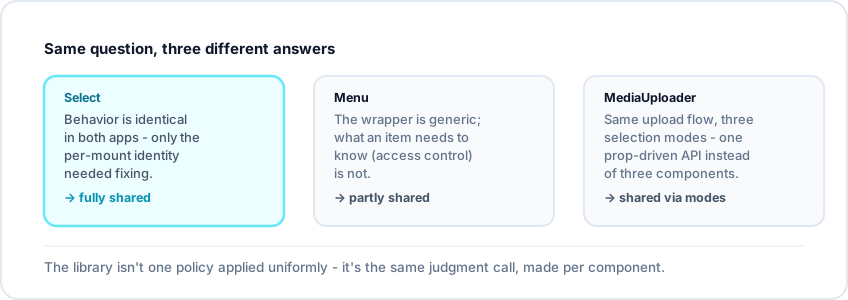
- MediaUploaderButton/MediaUploaderModal answers the same question a third way: it started as a single-purpose uploader and grew to cover three interactions (one file, several files, several with one marked as thumbnail)
- Instead of forking into three components, it stayed one, with a prop that selects the mode. Both apps use it without needing to know the other exists
FAQ